People ask me what should be on the homepage. They usually want a layout they can copy onto any business. The honest answer is that it depends on what the site is for. A business that sells a product or a set of courses needs a different homepage from a play therapist, a church, or a tutoring company. If you copy the wrong pattern, people land, they cannot find the thing they came for, and they leave.
I recorded a walkthrough of this because it is easier to show than to list. The rest of this post is that walkthrough, written out, with the same sites we actually built. I am not going to give you a twelve-section template. I am going to show you how three different homepages were decided, and then how you decide yours.
A site that sells a product or a course
When the job of the site is to sell a digital product or a set of courses, the homepage can stay on that sale. You show results. You explain why someone should use the product. Then you put the products on the page. That layout is built to keep someone in the buying path. It is a good fit for that kind of business, because the visitor already arrived ready to look at an offer.
It is a poor fit for most of the service businesses we work with. A parent looking for play therapy in Hillcrest did not come to browse a catalogue. They came to understand who Penelope is, what she offers, and how to get in touch. If we made her homepage look like a course funnel, we would bury the three things they actually need under a sales page they did not ask for.
Lead people to the sections they came for
For service businesses, and for most of the sites we build, we prefer to lead people to the sections they are already looking for. The homepage is a map. It should give a brief idea of what the site holds, then send them to About, Services, Testimonials, Contact, or whatever those pages are called in that business.
The menu and the homepage should agree. If the important pages are About, Services, Testimonials and Contact, those are the areas we want the homepage to point at. The visitor should be able to get there in one scroll and one click, not after hunting through a long sales letter.
Penelope Kate

Penelope Kate is a play therapist in Hillcrest. Her main sections are About, Services, Testimonials and Contact. That is the map. Those are the pages a parent needs, so those are the pages the homepage has to lead to.
The hero welcomes you and says what the business does: all behaviour is a message. You do not have to guess. Then an intro, so you meet Penelope before you meet a price. Then her three service offerings: child support, parent support, and teacher support. Then testimonials, so a visitor can hear how other families found the work. Then a call to action and the footer, which send people back to the same important places.
That is a homepage doing the job of a map, not the job of a checkout. Someone can get a brief idea of what the site has, and they can find the information they came for without being walked through a funnel first.
Northplace Church
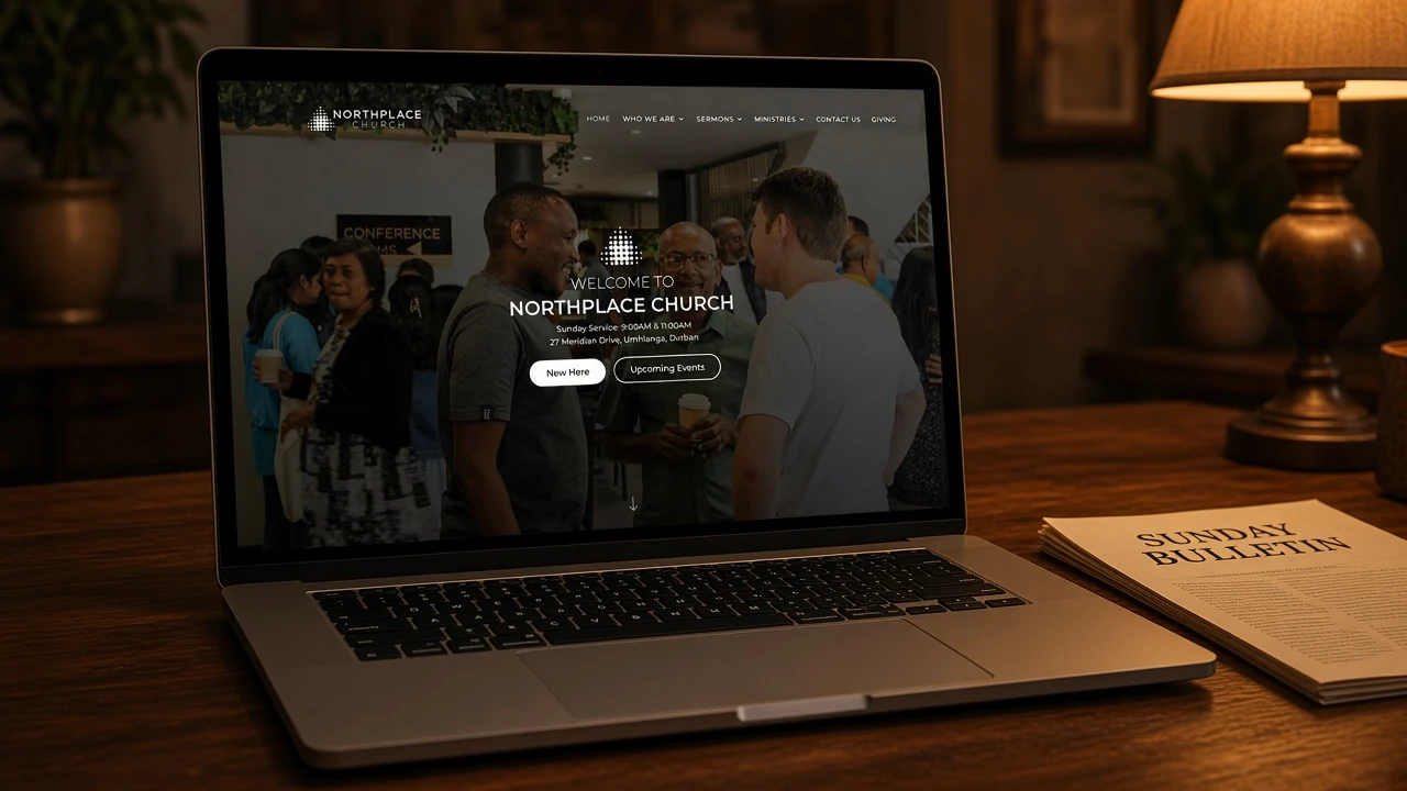
A church needs a different map. You would expect an intro that explains who they are, then sermons, then the ministries. Northplace Church in Umhlanga is built that way.
The hero welcomes you, and it puts the practical facts up front: Sunday at 9:00 and 11:00, 27 Meridian Drive. People arriving for the first time need the time and the address before they need a long brand story. Then an intro. Then the latest sermons, so someone who missed Sunday can still catch up. Then the three main ministries: kids, youth, and young adults. Then a few extra sections the church wants a visitor to see, and the footer.
Same idea as Penelope. Different sections, because the visitor came for different things. A parent looking for kids ministry should not have to watch a product video first. They should see Kids, the time, and a way to find out more.
Ace Tutors
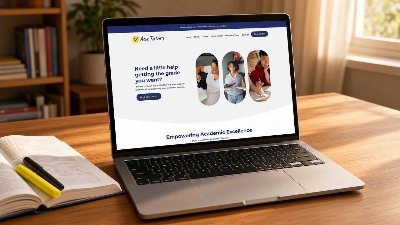
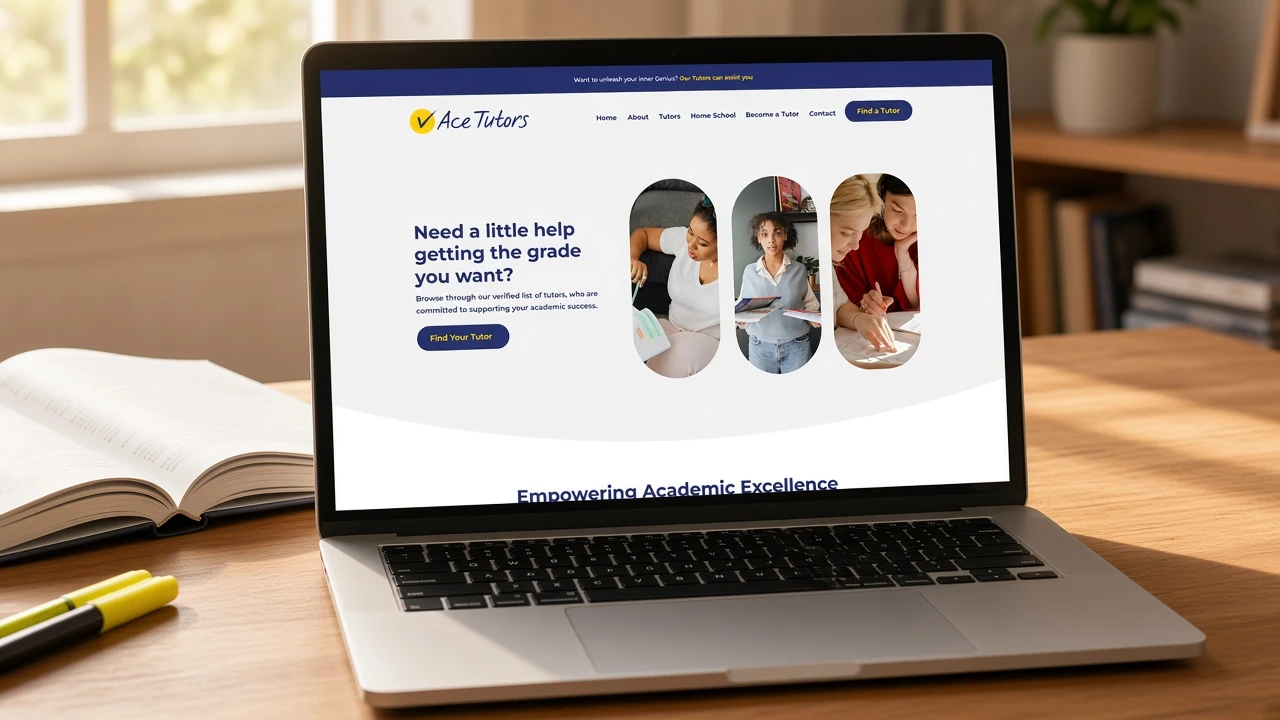
Ace Tutors is a tutoring company. The important sections are an intro, the tutors, and the two actions a visitor actually came to do: find a tutor, or become a tutor.
The hero asks if you need a little help getting the grade you want, and it points at Find Your Tutor. Then an intro. Then some of the tutors you can hire to help your kids. Then the calls to action and the footer. A parent can see who they would be hiring without digging through five other pages first.
That is the same rule again. The homepage is not trying to be every page. It is trying to get you to the tutors, or to the form, as quickly as a stranger can manage it.
How to decide what goes on yours
Write down the two or three things a stranger came to find. Those become the sections under the hero. The hero explains what you do. The next blocks take them there. The footer repeats the same links, so if they skip the middle they still land in the right place.
If you sell a product or a course, the homepage can stay on the product. Show results, explain why, then show the offer. If you sell a service, lead people to the pages that answer who you are, what you do, what others said, and how to get in touch. Do not copy a course layout onto a service business because it looked busy in a screenshot.
If you want to redo the homepage, send us the URL. We will look at it with you and tell you which sections your visitors are actually hunting for. That conversation is more useful than another template.